How Project Photos Help a Los Angeles Kitchen Remodeler Earn Design Consults
Why do photos carry so much weight for a kitchen remodeler?
A kitchen remodel is a large decision made slowly. A homeowner in Los Angeles may spend a year thinking about it, collecting pictures, talking to neighbors and visiting websites late in the evening. During that time the remodeler is usually judged by images alone, because there is nothing else to touch. A photograph of a finished kitchen answers the first silent question every visitor has: can this company make a room look the way I want mine to look?
This article takes the form of questions and answers, because remodeling owners tend to ask the same things once they decide the photography needs attention. The answers focus on how pictures are used, where they matter and how they connect to the conversations that lead to a design consult.
Where should the strongest photo on a project go first?
The lead image of each project should appear at the top of the project page, at the head of the gallery grid and on the map listing. It deserves the most care: a wide frame, good light, level lines and a room that looks like a real home. Visitors decide in a second or two whether to keep looking, and the lead image makes that decision for them.
Supporting images then explain the project. A sequence of the diagonal views, the island, the cooking wall and two or three close details gives the visitor everything needed to understand the layout and the finish quality without reading a word.
How many photos should a project page carry?
Enough to tell the story, and no more. A typical page works well with a lead image, a handful of supporting frames, one before and after pair and a short paragraph describing what changed. A gallery that shows dozens of near identical frames of the same cabinet wall buries the good ones. Visitors on phones, who now make up much of the traffic, scroll quickly and abandon long galleries.
Quality and variety beat volume. A pair of wide views, a couple of angles on the island and a few details cover most kitchens. If a project has an unusual feature, such as a hidden pantry door or a custom hood, give it a frame of its own.
What do before and after pairs do that single photos cannot?
They show the work. A beautiful finished kitchen can belong to anybody, but a before frame next to it proves that this company did the change. For older houses in Pasadena, Glendale and Silver Lake, where original layouts can be cramped, a before and after pair also reassures the homeowner that a difficult room can be solved.
The pair works best when both frames are taken from the same spot at the same height. A tape mark on the floor before demolition makes that possible. Without it the second photo will drift a step to the left, and the comparison will look unconvincing.
How should photos be described in captions and alt text?
Write what the picture shows in plain words. A caption such as "galley kitchen opened to the dining room, with a new island and recessed lighting" helps both the reader and anyone using a screen reader. Alt text should be a short factual description, not a string of keywords and not a place name that does not match the home. If the photo is from a house in the San Fernando Valley, do not label it with a different neighborhood because it sounds more attractive.
Captions also give the remodeler a place to mention the neighborhood, the style of home and the main change, which helps a local visitor recognize the kind of work they want. Keep captions to a sentence or two so they stay readable on small screens.
How do photos work on a map listing?
The map listing is often the first place a homeowner sees the business. The cover image, the logo and the first handful of project photos appear before the website is ever opened. Using real project photographs there, rather than stock pictures, tells a visitor that the business has actually built what it describes.
New photos should be added steadily after each completed job. A listing with recent images signals an active company, and it gives the homeowner more to look at before deciding to call. Share varied rooms: a wide kitchen, a close detail, a finished pantry. A listing that repeats one view looks thin.
What should be shot to support the first consult?
At the design consult the remodeler often sits at the homeowner's table with a tablet or a printed folder. A short portfolio chosen for that homeowner works far better than the whole gallery. If the homeowner lives in a mid century house in the Westside, show mid century projects. If they have a condo in Santa Monica with tight clearances, show galley and L shaped solutions that handled similar limits.
That kind of match needs a library organized by house type, layout and finish, not only by date. When project folders carry plain labels such as bungalow galley, condo L shape or open plan island, the right pictures can be found in seconds before a meeting.
Do in progress photos belong on the website?
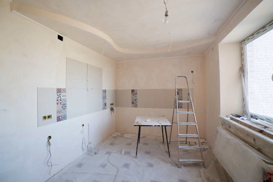
A few of them do. Homeowners want to know what the weeks of a remodel look like, and a short gallery of framing, rough plumbing, cabinet installs and tile work shows the process is organized. It answers questions that otherwise come up as worries during the consult. Choose frames that look orderly, with tidy floors and protected surfaces, because messy construction photos raise concerns instead of settling them.
In progress frames also act as a record. If the Department of Building and Safety asks about what was behind a wall, or a homeowner later wants to add an outlet, the photos show exactly where the lines run. They deserve a place in the project folder even if only a handful are published.
Is it a problem if photos look edited?
Light adjustment is normal: straightening verticals, balancing exposure, correcting color. Heavy retouching is a risk. If a countertop looks cleaner or the room looks larger than it is, the homeowner will notice at the first visit, and trust drops at the moment it matters most. The rule of thumb is that a photo should look like the room on a very good day, not like a different room.
Consistency helps too. Similar light, similar angles and a similar editing style make the gallery look like the product of one careful company. A mix of dark, orange tinted phone pictures and bright professional images makes the business look uneven.
How often should the gallery be refreshed?
Add each completed project within a couple of weeks while the details are fresh, and review the gallery twice a year. Retire pictures of finishes that are no longer offered, replace weak lead images with better ones and move the strongest recent work to the top. A gallery that has not changed in years suggests the business has stopped building, even when the schedule is full.
Which mistakes show up most often in remodeling galleries?
- Photos shot in harsh afternoon sun with blown out windows and glare on every glossy surface.
- Crooked verticals from a wide lens tilted downward.
- Cluttered counters, dish racks and trash bins left in frame.
- Mismatched bulbs that give the room an orange and blue cast.
- No before photos, so the viewer cannot judge the change.
- Files named with camera numbers, which makes later selection slow.
Each of these has a mechanical fix, and none requires an expensive camera. A level, a tripod, a cloth and a plan solve most of them.
What is the simplest routine that keeps this working?
Decide at the start of every project that it will be photographed. Take before photos on day one, a few in progress frames at the main milestones and a full set at the end, using the same shot list each time. File everything in a labeled folder, choose the lead image within a week and publish. A routine like this takes a few hours per project and produces a gallery that does steady work for years in front of homeowners across Los Angeles County.